
showcase of
A Cosmetic Ecommerce Website
A Cosmetic Ecommerce Website
A Cosmetic Ecommerce Website


Project Overview
The project goal is to design a seamless, aesthetic shopping experience for a premium skincare brand.

Project Type
Personal Concept
Role
UI/UX Designer
Tools
Figma, Framer
Project Overview
The project goal is to design a seamless, aesthetic shopping experience for a premium skincare brand.
Project Type
Personal Concept
Role
UI/UX Designer
Tools
Figma, Framer
Project Overview
The project goal is to design a seamless, aesthetic shopping experience for a premium skincare brand.
Project Type
Personal Concept
Role
UI/UX Designer
Tools
Figma, Framer

Problem Statement
Many existing beauty websites are cluttered, overwhelming, or overly commercial. Customers especially skincare enthusiasts want a calming, luxurious, and informative experience.
Challenges Identified

1
Lack of clear product categorization
2
Weak visual hierarchy

3
Generic product visuals that don’t communicate value
4
Distracting interfaces that undermine trust in premium pricing
Problem Statement
Many existing beauty websites are cluttered, overwhelming, or overly commercial. Customers especially skincare enthusiasts want a calming, luxurious, and informative experience.
Challenges Identified
1
Lack of clear product categorization
2
Weak visual hierarchy
3
Generic product visuals that don’t communicate value
4
Distracting interfaces that undermine trust in premium pricing

Target Audience
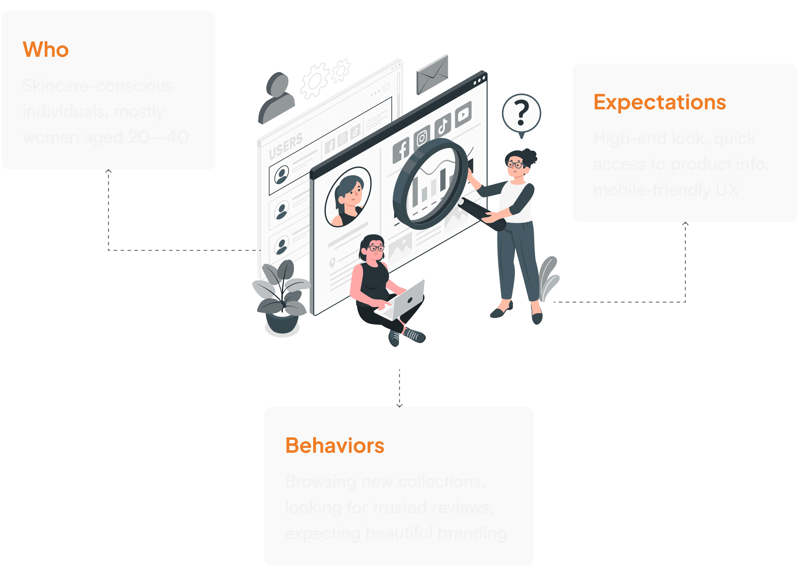
Target Audience
Target Audience
Design Goals

1
Design a UI that reflects the premium nature of the products
1
Design a UI that reflects the premium nature of the products

2
Simplify product discovery
2
Simplify product discovery
3
Highlight categories, promotions, and new arrivals
3
Highlight categories, promotions, and new arrivals
Design Goals
1
Design a UI that reflects the premium nature of the products
2
Simplify product discovery
3
Highlight categories, promotions, and new arrivals
Design Goals
1
Design a UI that reflects the premium nature of the products
2
Simplify product discovery
3
Highlight categories, promotions, and new arrivals

Exploring the Final UI
Hero Section
Purpose: Create a strong first impression and invite users to explore.

What the user needs
Immediate clarity on what the brand offers and why they should care visually engaging and emotionally resonant.


How this section addresses that need
Split layout (text left, product right) creates a natural visual flow
Strong, emotional headline: “Reveal The Beauty Of Skin” builds a personal connection
Clean CTA (“Explore More”) drives action without overwhelming
Brand emblem subtly signals premium identity and builds trust
Category Navigation
Purpose: Help users quickly find product types.

What the user needs
Quick access to key product categories without cognitive overload.
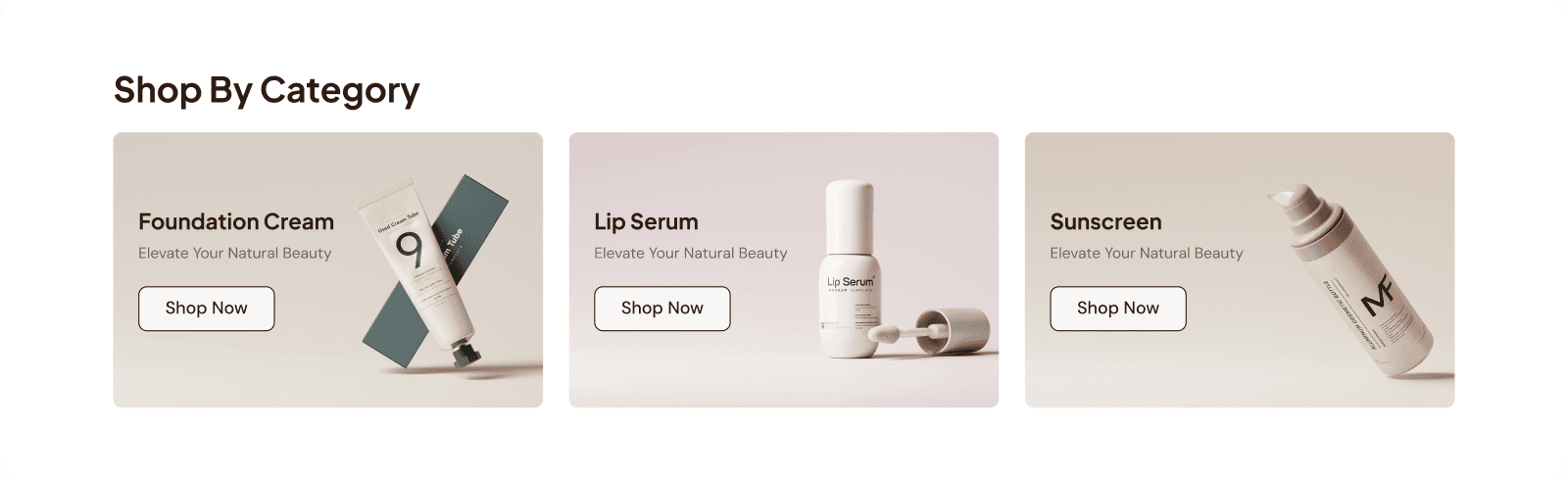

How this section addresses that need
3 distinct categories (Foundation Cream, Lip Serum, Sunscreen) simplify decision-making.
Visual separation with unique tones improves scannability.
Clear “Shop Now” CTAs help users dive directly into browsing.
Best Seller Grid
Purpose: Highlight popular products for easy browsing and buying.
What the user needs
Easy product comparison and fast decisions on best-selling items

How this section addresses that need
Consistent, clean product cards enhance visual clarity
Displays essential info at a glance: name, rating, price, discount
Built-in actions (quantity selector, add-to-cart, free delivery badge) streamline the shopping process
Grid is responsive and adapts well across devices
New Collection Banner
Purpose: Promote new arrivals in an eye-catching way.
What the user needs
Stay up-to-date with new arrivals and feel inspired to explore.

How this section addresses that need
Prominent, visually rich banner grabs attention
Consistent “Explore More” CTA builds familiarity
Beautiful staging and soft shadows create an editorial, high-end look that sparks curiosity
Footer
Purpose: Share key info and encourage user engagement.
What the user needs
Essential brand info, trust signals, and a way to stay connected.
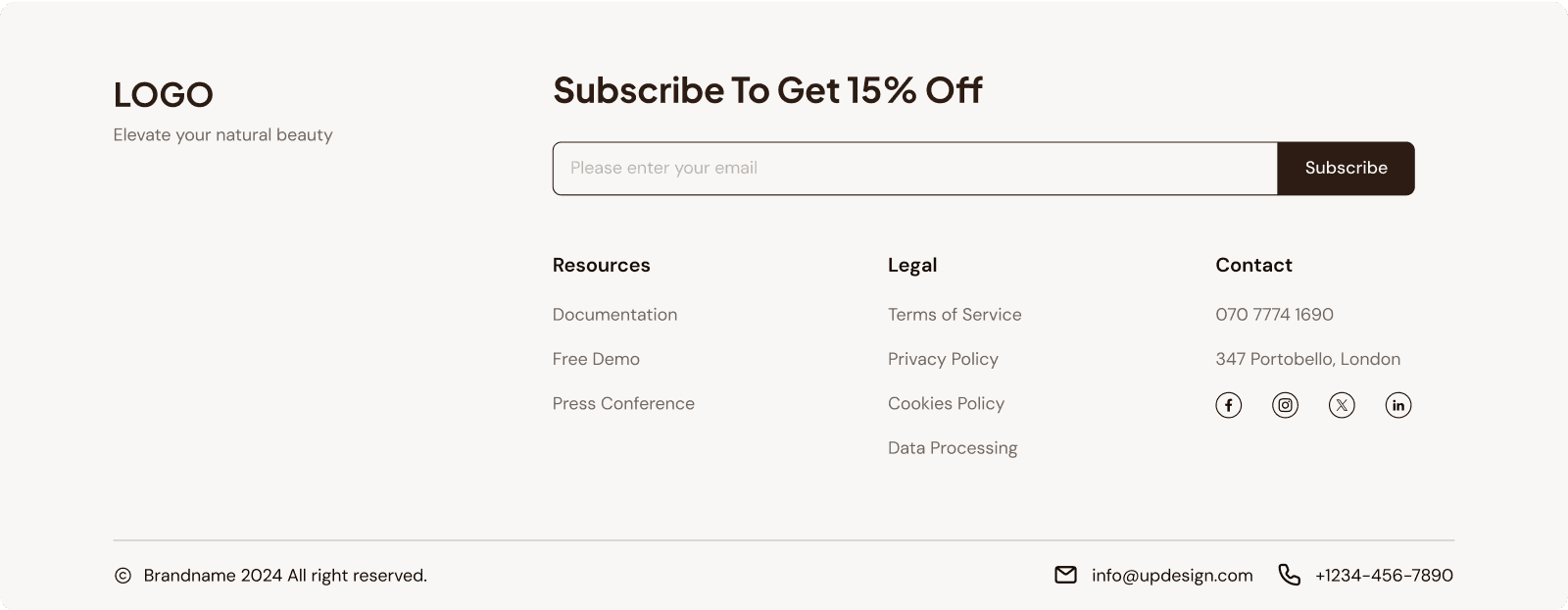
How this section addresses that need
Clear 3-column layout keeps navigation simple
Email signup with 15% off creates incentive and builds retention
Legal links, contact, and social icons support transparency and trust
Exploring the Final UI
Hero Section
Purpose: Create a strong first impression and invite users to explore.
What the user needs
Immediate clarity on what the brand offers and why they should care visually engaging and emotionally resonant.
How this section addresses that need
Split layout (text left, product right) creates a natural visual flow
Strong, emotional headline: “Reveal The Beauty Of Skin” builds a personal connection
Clean CTA (“Explore More”) drives action without overwhelming
Brand emblem subtly signals premium identity and builds trust
Category Navigation
Purpose: Help users quickly find product types.
What the user needs
Quick access to key product categories without cognitive overload.
How this section addresses that need
3 distinct categories (Foundation Cream, Lip Serum, Sunscreen) simplify decision-making.
Visual separation with unique tones improves scannability.
Clear “Shop Now” CTAs help users dive directly into browsing.
Best Seller Grid
Purpose: Highlight popular products for easy browsing and buying.
What the user needs
Easy product comparison and fast decisions on best-selling items
How this section addresses that need
Consistent, clean product cards enhance visual clarity
Displays essential info at a glance: name, rating, price, discount
Built-in actions (quantity selector, add-to-cart, free delivery badge) streamline the shopping process
Grid is responsive and adapts well across devices
New Collection Banner
Purpose: Promote new arrivals in an eye-catching way.
What the user needs
Stay up-to-date with new arrivals and feel inspired to explore.
How this section addresses that need
Prominent, visually rich banner grabs attention
Consistent “Explore More” CTA builds familiarity
Beautiful staging and soft shadows create an editorial, high-end look that sparks curiosity
Footer
Purpose: Share key info and encourage user engagement.
What the user needs
Essential brand info, trust signals, and a way to stay connected.
How this section addresses that need
Clear 3-column layout keeps navigation simple
Email signup with 15% off creates incentive and builds retention
Legal links, contact, and social icons support transparency and trust

Responsive Design

Designed for desktop-first, but easily adaptable for mobile
Product grid collapses to fewer columns
Navigation remains clear and accessible
Buttons large enough for mobile tap targets
Responsive Design
Designed for desktop-first, but easily adaptable for mobile
Product grid collapses to fewer columns
Navigation remains clear and accessible
Buttons large enough for mobile tap targets
Responsive Design
Designed for desktop-first, but easily adaptable for mobile
Product grid collapses to fewer columns
Navigation remains clear and accessible
Buttons large enough for mobile tap targets


the Website Concept
This website concept was designed to showcase a premium skincare brand through a clean, modern, and user-focused e-commerce experience.
the Website Concept
This website concept was designed to showcase a premium skincare brand through a clean, modern, and user-focused e-commerce experience.
the Website Concept
This website concept was designed to showcase a premium skincare brand through a clean, modern, and user-focused e-commerce experience.
Other Projects


Let's talk!
Got a project in mind? Fill out the form to let me help you.

Email: uyenpham0209@gmail.com
